
This guide will walk you through:
Planning & KPI design
Data connection & transformation (Power Query)
Modeling & DAX essentials
Visualization, interactivity & layout templates
Publishing, refresh, governance & performance checks
1) Start with the question: Plan your dashboard
Every useful dashboard answers a clear set of questions. Start here to save yourself rebuilds later.
Checklist (planning):
Who is the primary user? (e.g., CMO, Operations Manager)
What are the top 3 decisions the dashboard must support?
Which KPIs answer those decisions? (examples below)
What is the data cadence (real-time / daily / weekly)?
Where will this dashboard live and who can access it?
Example KPIs (marketing dashboard):
Weekly leads (vs target)
Conversion rate by channel
Cost per acquisition (CPA)
30-day campaign ROI
If you want a beginner primer on what Power BI is, read: What Is Power BI? A Beginner’s Guide to Creating Interactive Reports.(attach link)
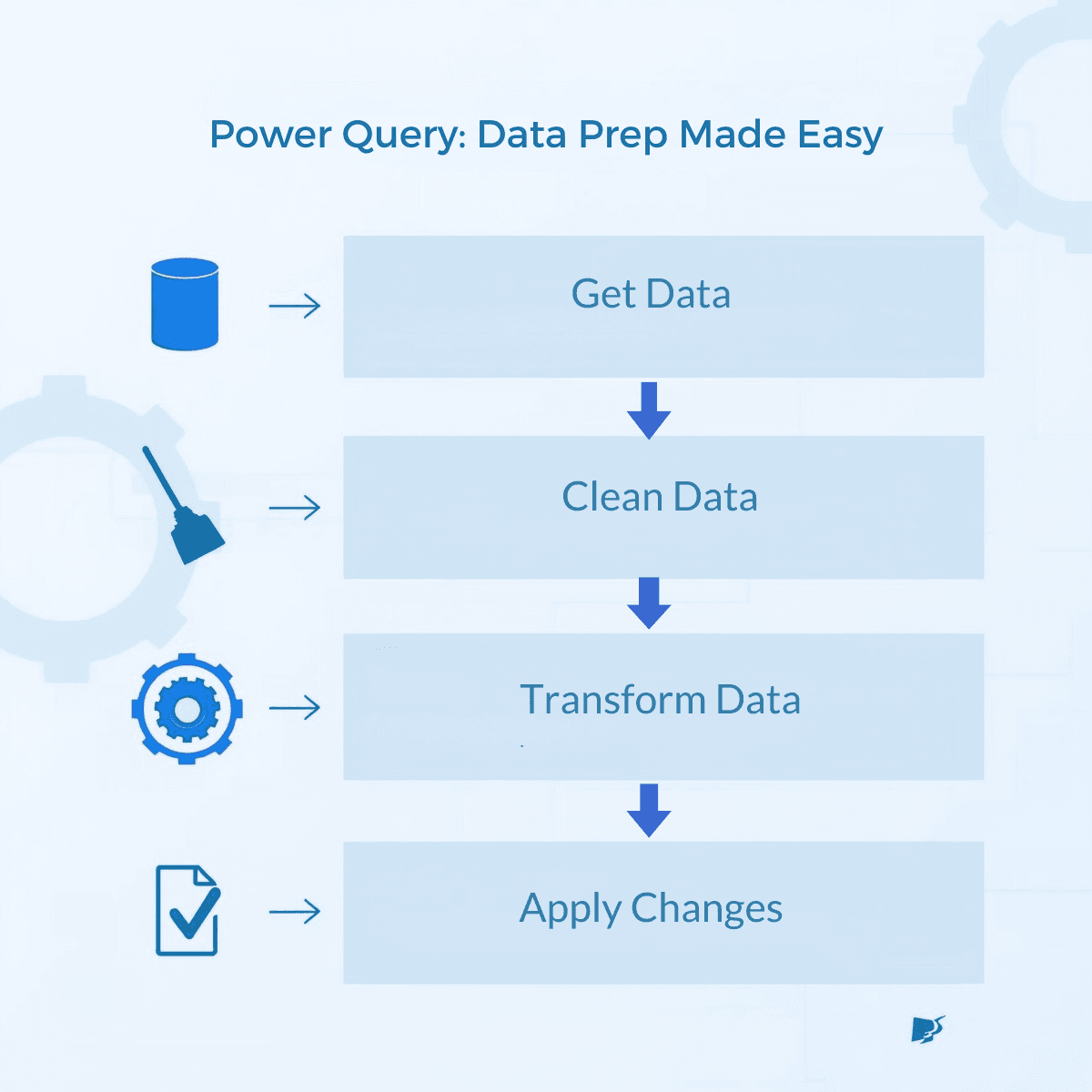
2) Connect to your data (Power Query)
Power Query is where most dashboards are made or broken. Cleaning and shaping here makes modeling easier later.
Step-by-step:
Open Power BI Desktop → Get Data → choose source (Excel, CSV, SQL, Google Sheets via connector, API).
In the Power Query editor:
Remove unnecessary columns.
Rename fields clearly (
OrderDatenotOD_01).Standardize date/time formats and time zones.
Trim, split, and replace text as needed.
Merge/join tables only after confirming keys (left join for master lists, inner join for strictly matching rows).
Add calculated columns only if they’re purely descriptive — prefer measures for calculations used in visuals.
Apply Query Folding when possible (keep transformations pushed to the source for speed).
Power Query tips:
Use
Table.Buffersparingly as it can help in complex steps but increases memory use.Add an
IsStagingquery folder for raw imports and aTransformationsfolder for shapes — this makes debugging easier.Document each major transformation with a short comment (right-click step → rename).
3) Model your data (star schema is your friend)
Good modelling improves performance and simplifies DAX.
Modeling rules:
Aim for a star schema: one or more fact tables (transactions, events) joined to dimension tables (date, product, customer).
Avoid bi-directional relationships unless needed for specific cross-filtering patterns. Prefer single-direction relationships.
Use surrogate keys where natural keys are messy.
Create a date/calendar table with fiscal periods and mark it as
Datein model settings.
Why star schema? It improves performance, reduces ambiguous relationships, and makes DAX measures straightforward.

4) DAX essentials: create measures, not columns
DAX measures calculate on the fly and keep model size small.
Common DAX measures (copy-paste starters):
Best practices:
Use
CALCULATE()to change filter context.Prefer
VARfor readability and performance in complex measures.Test measures in a simple table visual before adding to cards/charts.
Keep naming consistent: prefix measures by domain (
Sales - Total,Sales - YoY %) if you have many.
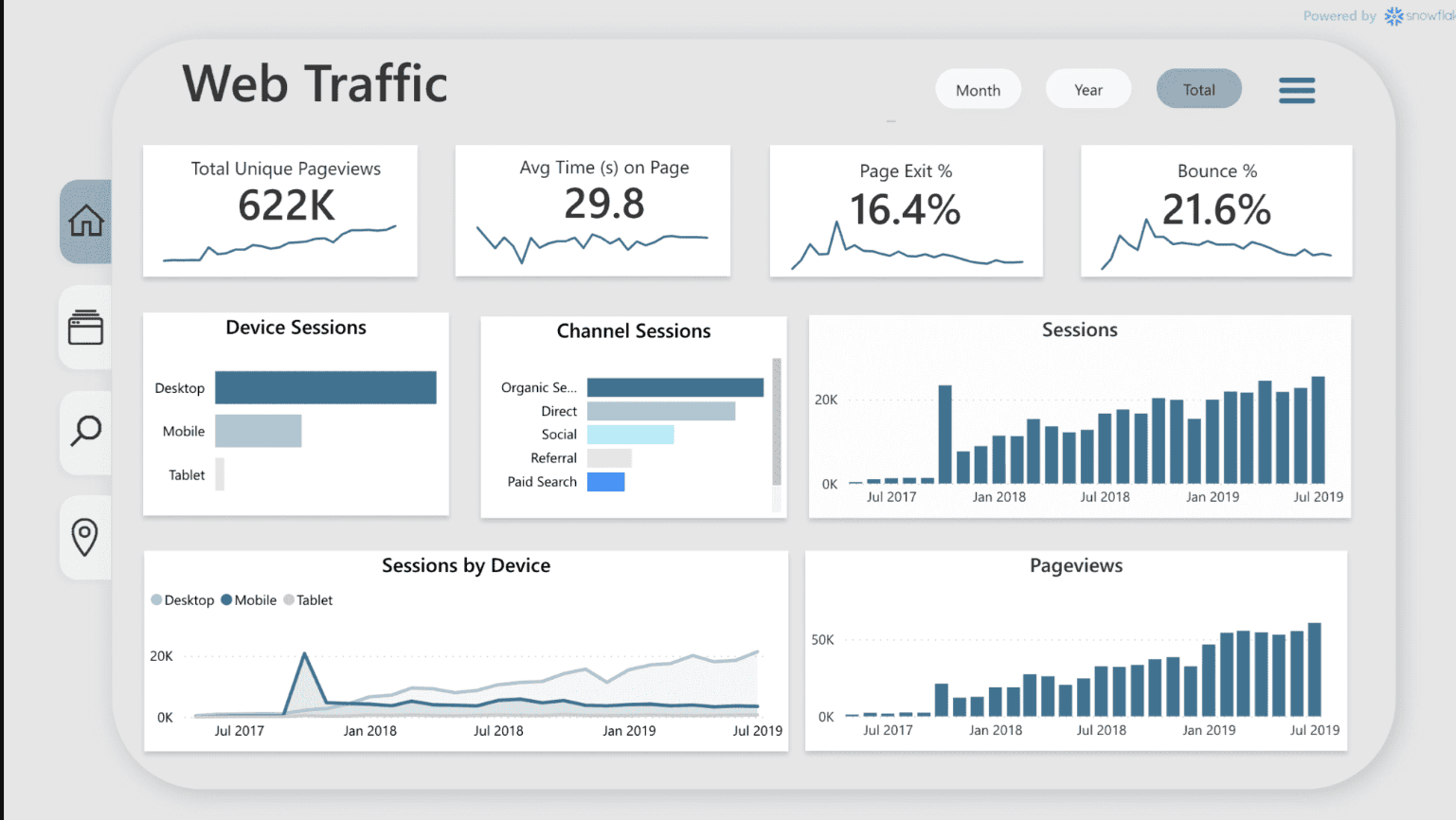
5) Design the visuals: clarity over decoration
A dashboard is a story. Visuals should lead the user from summary to detail.
Layout template (recommended):
Row / Area | Purpose |
|---|---|
Header (top) | Title, date, filters applied (global slicers) |
KPI band | 3–5 KPI cards (trend + small variance indicator) |
Main area | Primary chart (trend or cohort) |
Secondary area | Breakdowns (by channel, region, product) |
Details / Table | Top N rows, exportable detail view |
Footer | Data source, last refreshed, contact owner |
Visual choices:
KPI cards for headline metrics.
Line charts for trends.
Bar charts for categorical comparisons.
Waterfall for contribution analysis.
Matrix/table for transactional detail.
Interactivity:
Use slicers for common filters (date, region).
Use drillthrough pages for deep dives.
Add tooltips or report page tooltips for context & explanations.
Keep cross-filtering predictable — set visual interactions to avoid accidental clears.
6) Performance & accessibility checks
Poor performance kills adoption. Run these checks before publishing.
Performance checklist:
Reduce cardinality in visuals (don’t put a million distinct values in an axis).
Limit visuals on a single page to 6–8.
Use aggregations or pre-aggregated views for very large fact tables.
Test with scheduled refresh and consider incremental refresh for large datasets.
Review Query Diagnostics in Power BI Desktop to spot slow steps.
Accessibility:
Use high-contrast colors and readable font sizes.
Provide alt text for visuals (Report → Accessibility).
Check tab order for keyboard navigation.
7) Publish, schedule refresh & secure
When the report works locally, publish it to the Power BI Service.
Steps to publish:
Save PBIX → Publish → choose workspace.
In Power BI Service: set dataset refresh (credentials, gateway if on-prem).
Create an app workspace and publish an app for broader distribution.
Configure row-level security (RLS) if users must see subsetted data.
Enable data alerts for critical KPIs (e.g., if spend > threshold).
Governance pointers:
Tag data owners and document dataset lineage.
Use workspace permissions (Admin/Member/Contributor/View).
For enterprise rollouts, consider Premium capacities for performance and advanced features.
If you’re evaluating platforms or thinking about cost, see our ROI model: Calculating the ROI of BI Consulting and Data Integration Services.
8) Share, gather feedback, iterate
Adoption is a process — collect usage metrics and feedback.
Post-publish steps:
Monitor adoption: active users, frequency, time spent.
Run a short survey or schedule walkthroughs with key stakeholders.
Iterate: swap visuals that aren’t used, add new drillthroughs based on requests.
Tip: Add a tiny “How to interpret this dashboard” card — saves many support questions.
9) Practical resources & templates
Quick reference table — what to use when
Need | Power BI feature |
|---|---|
Clean and join data | Power Query (M) |
Time intelligence | Date table + DAX (SAMEPERIODLASTYEAR, TOTALYTD) |
Performance on large data | DirectQuery/Composite models + Incremental refresh |
User-level security | Row-level security (RLS) |
Embedded analytics | Power BI Embedded (for apps) |
Want a visual template? Read Power BI vs Tableau vs Looker to choose the toolset that matches your embedding & governance needs:
10) FAQ
Q: How long does it take to build a basic dashboard?
A: A simple dashboard (single data source, 4 KPIs) can be built in a few hours. Complex enterprise dashboards with modeling and governance take weeks.
Q: Should I use DirectQuery or import mode?
A: Use import for speed and rich DAX; use DirectQuery when data must be real-time or you cannot import large datasets. Composite models let you mix both.
Q: Can I export visuals to PowerPoint?
A: Yes — Power BI allows exporting reports to PowerPoint and PDF. For scheduled exports, consider Power Automate connectors.
Q: I’m not technical — can I still build dashboards?
A: Absolutely. Power Query and drag-and-drop viz make basic dashboards accessible; learning core DAX will unlock more advanced capabilities.
Building a Power BI dashboard is all about turning raw data into actionable insights through thoughtful design and clear storytelling. By following these steps, you not only create visually engaging reports but also empower users to make smarter, faster decisions. With practice, your dashboards will become a vital tool for driving data‑driven success in your organization.