
If you haven’t already, read these primers first:
What Is Power BI? A Beginner’s Guide to Creating Interactive Reports — conceptual primer.
How to Build a Power BI Dashboard: Step-by-Step Tutorial — hands-on implementation.
Power BI vs Tableau vs Looker) — vendor decision context.
Why marketing analytics in Power BI needs special treatment
Marketing data is messy: multiple ad networks, tracking pixels, CRMs, product analytics, and offline sources. To create a reliable marketing dashboard you must unify disparate sources, pick the right KPIs, and choose an attribution and measurement framework that aligns with business goals. Power BI’s strengths (powerful modeling, DAX, and integration with Microsoft/Cloud ecosystems) make it ideal when used correctly.
1. Start with outcomes i.e pick KPIs tied to decisions
Marketing dashboards shouldn’t be vanity-ware. Define the decisions the dashboard must inform and choose KPIs accordingly.
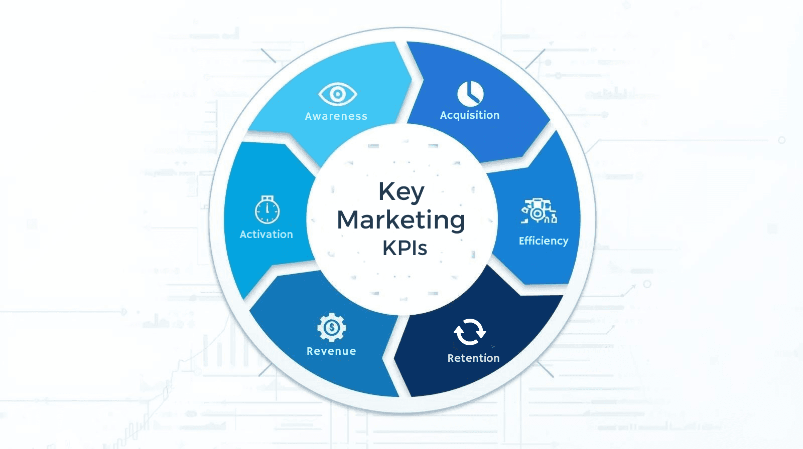
Core marketing KPI categories
Awareness: Impressions, reach, CPM
Acquisition: Clicks, CTR, new users, cost per acquisition (CPA)
Activation/Engagement: Active users, time on site, engagement rate
Revenue: MRR, attributable revenue, ROAS, LTV
Retention: Churn rate, repeat purchase rate, cohort retention
Efficiency: CAC payback, marketing ROI
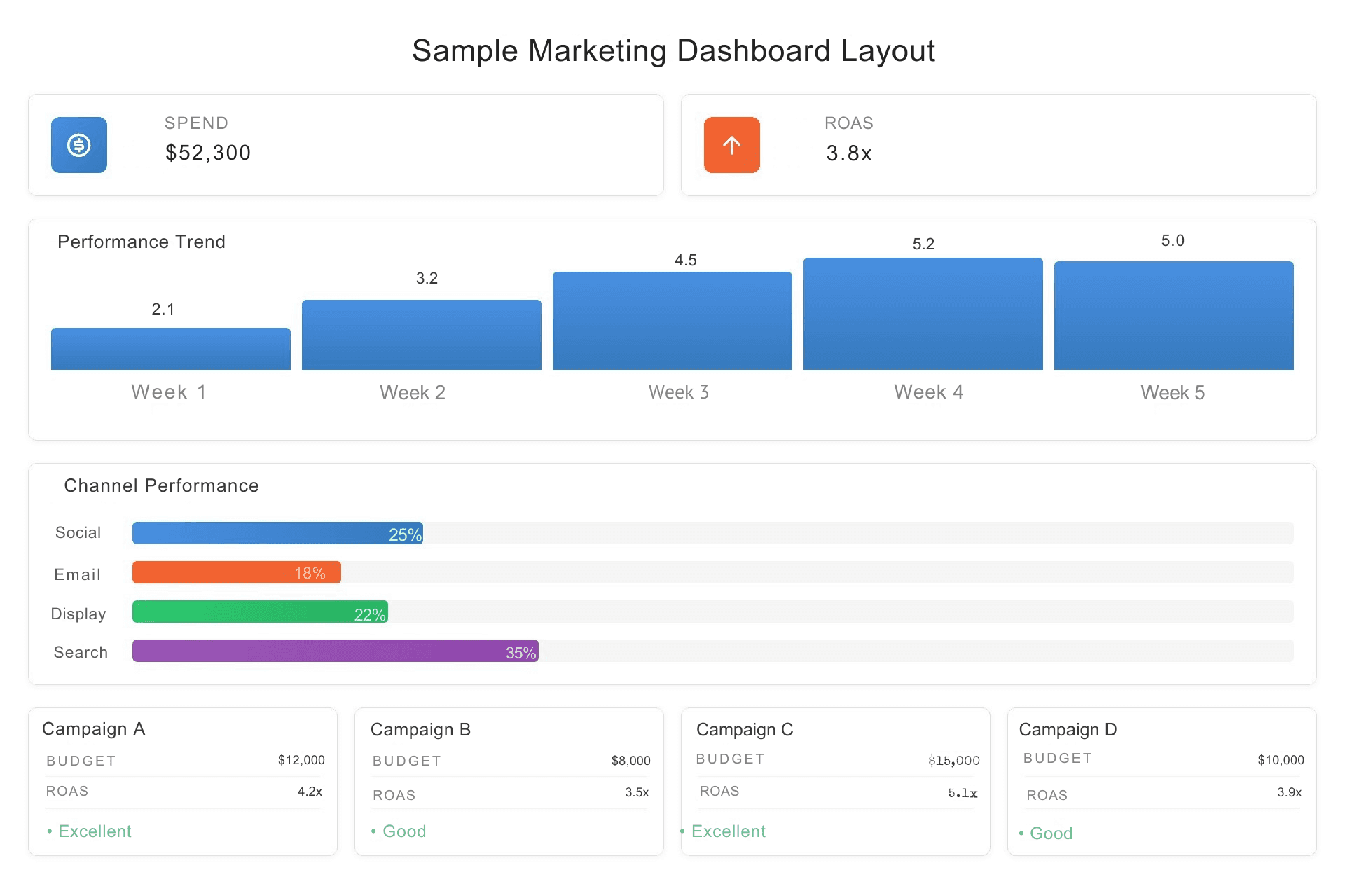
Example KPI card layout (for executives):
Top-left: Total Marketing Spend (period)
Top-center: Attributable Revenue
Top-right: ROAS
Secondary: Top 3 campaigns by LTV, Cost per Conversion by Channel
2. Data model best practices for marketing analytics
A resilient data model prevents misleading insights and keeps dashboards fast.
Recommended model structure
Fact tables: AdEvents (impressions/clicks), Sessions, Conversions, Orders, CostEvents
Dimensions: Date, Campaign, Channel, Creative, Audience, Geo, Product, Customer
Star schema: Keep facts separate from dimensions; avoid many-to-many relationships when possible
Why it matters
Enables correct aggregation (e.g., counting conversions vs counting sessions)
Simplifies DAX measures and time-intelligence functions
Improves performance (query efficiency & cacheability)
Integration tips
Import daily aggregated ad performance from ad platforms (instead of raw event logs) for common analyses; use raw streaming for real-time diagnostics only.
Connect CRM sales data to attribution tables using order IDs or click IDs (UTM/cookie stitching).
Use a canonical naming convention for campaign, source, medium (standardize UTM naming early).
3. Attribution models — choose with intent
There’s no perfect model; pick the one aligned with your funnel and business questions.
Common models (table)
Model | Best for | Pros | Cons |
|---|---|---|---|
Last-click | Simple, short-funnel conversions | Easy to implement | Ignores upper-funnel influence |
First-click | Awareness-focused campaigns | Credits discovery efforts | Overweights first touch |
Linear | Understand multi-touch influence | Fair distribution across touches | May undervalue decisive touch |
Time-decay | Multi-touch with recency bias | Reflects recent influence | Params (half-life) require tuning |
Position-based (U-shaped) | Balances first & last | Recognizes middle support | Weight choice subjective |
Data-driven (ML) | Sophisticated enterprise models | Uses real behavior to assign credit | Requires volume & modeling resources |
Practical approach
Start with last-click for early reporting simplicity.
Add a linear or position-based view for multi-touch visibility.
When volume and infrastructure permit, run a data-driven model (or use vendor attribution + validate with your own experiments).
Power BI tip: Maintain multiple attribution tables/measures in your model so business stakeholders can switch views (Last-click / First-click / Linear) via slicers and compare impact side-by-side.
4. DAX examples for marketing measures
Here are reusable DAX starters you can adapt.
Measure best practices
Use
DIVIDE()to avoid divide-by-zero errors.Create intermediate VARs for clarity in complex measures.
Test measures in simple table visuals before adding them to KPI cards.
5. Visualization & storytelling for marketing
People scan marketing dashboards quickly thus visual clarity matters.
Layout suggestions
Top row: Executive KPI band (Spend, Conversions, CPA, ROAS)
Second row: Trend charts (Spend vs Conversions over time)
Third row: Channel performance (stacked bar / small multiples)
Fourth row: Campaign & creative breakdown + cohort retention chart
Visual tips
Use sparkline or compact trend charts inside KPI cards for context.
Use small multiples for comparing similar campaigns/regions.
Show confidence intervals on forecasts or model-driven metrics when possible.
Add callout cards with quick recommended actions (e.g., pause campaign X, reallocate budget to Y) — makes dashboards prescriptive.
Accessibility: Use color-blind friendly palettes and ensure contrast for KPI values.
6. Operational practices: governance, refresh, and testing
Bad data kills trust. Operationalize your marketing analytics to maintain credibility.
Governance checklist
Canonical campaign naming: enforce UTM standards with validation (ingest-time or nightly job).
Dataset ownership: assign dataset owners and contact details in the report footer.
Lineage & documentation: use a data catalog and document transformations (Power Query steps).
RLS: secure customer-level data with row-level security if needed.
Refresh & latency
Use incremental refresh for large fact tables (campaigns, events).
Schedule hourly/daily refreshes based on business needs; avoid heavy real-time refresh unless necessary.
Track refresh health and alert on failures.
Data QA
Create a “data health” page showing counts by source, change rates, and sample rows.
Reconcile spend & conversions with ad platform invoices weekly.
7. Advanced topics: multi-touch modeling & experimentation
Multi-touch modeling
Consider using visitor-level stitching (click IDs, first-party cookies) to build a resilient multi-touch dataset.
Store session-level attribution and run periodic ML models (logistic regression, uplift models) in your data warehouse; surface model outputs in Power BI.
Experimentation
Integrate A/B test results into dashboards; show treatment vs control performance and convert to LTV uplift.
Use funnel and cohort views to validate if campaigns produce lasting engagement or simply short-term spikes.
8. KPIs & sample dashboard blueprint (table)
Area | KPI | Suggested visual |
|---|---|---|
Spend & Efficiency | Total Spend, CPA, CPM | KPI band + trend line |
Acquisition | New Users, Conversion Rate | Funnel visual + channel bar chart |
Revenue | Attributed Revenue, ROAS, LTV | KPI cards + cohort LTV chart |
Retention | Day 7/30 retention, churn | Cohort heatmap |
Creative Performance | CTR by creative, conversion by landing | Small multiples + scatter (CTR vs CPA) |
Data health | Missing UTM %, Unmapped spend | Gauge + table |
9. Common mistakes & how to avoid them
Mixing aggregated and event-level joins → causes double-counting. Fix: use consistent grain and star schema.
Trusting last-click alone → misallocates credit; provide multi-model views.
Too many visuals on a page → slows reports and confuses users; limit visuals to 6–8 per page.
No root-cause context → show related dimensions (creative, landing page) with filters so users can act.
10. Quick FAQ
Q: How should I standardize UTM parameters?
A: Use a controlled naming scheme and validate at collection. Enforce lowercase, consistent separators, and a campaign taxonomy (e.g., channel_campaign_objective_variant).
Q: Which is better for marketing analytics: DirectQuery or Import?
A: Import is preferred for speed and rich DAX; DirectQuery useful if data must be real-time or if datasets are too large to import. Composite models are powerful for mixing both.
Q: How do I prove marketing dashboard ROI to leadership?
A: Track time-saved on reporting, decisions changed due to insights, and revenue/cost improvements tied to actions. Use the ROI article template: Calculating the ROI of BI Consulting and Data Integration Services